


DESIGN
With Work by Davey, design isn’t just about how something looks — it’s about how it feels. Every line, color, and texture carries intention. We build visuals that move like film frames — rooted in emotion, guided by story, and crafted to last. Whether it’s a logo, identity system, product, or campaign asset, each piece is created through the lens of Sensitive Realism — design that feels cinematic, human, and alive in every context.

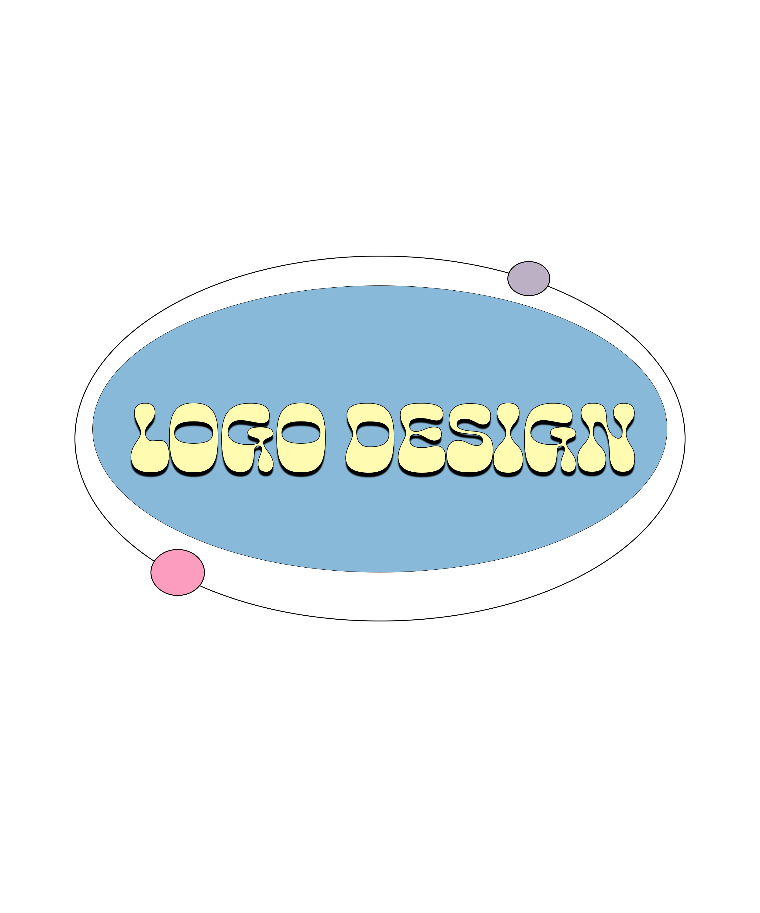
LOGO DESIGN
Work by Davey creates clean, modern marks that balance precision with character. Every logo is built to feel timeless across screens, print, and motion — simple at first glance, but layered with subtle grit and meaning. Rooted in Sensitive Realism, each design reflects the human story behind the brand, not just its name. These are logos meant to live — to breathe, scale, and stay recognizable anywhere they appear.
Primary logos, monograms, and alternate marks for all formats
• Optimized versions for web, print, and motion use
• Scalable design system with clear space and color guidelines


Product Design


From packaging to apparel to photoreal 3D mockups, Work by Davey designs products that look and feel real — tactile, intentional, and ready to launch. Each concept bridges design and storytelling, built to make your audience feel something before they even touch it. This is Sensitive Realism in physical form: details that reveal the heart of your brand through texture, balance, and presentation.

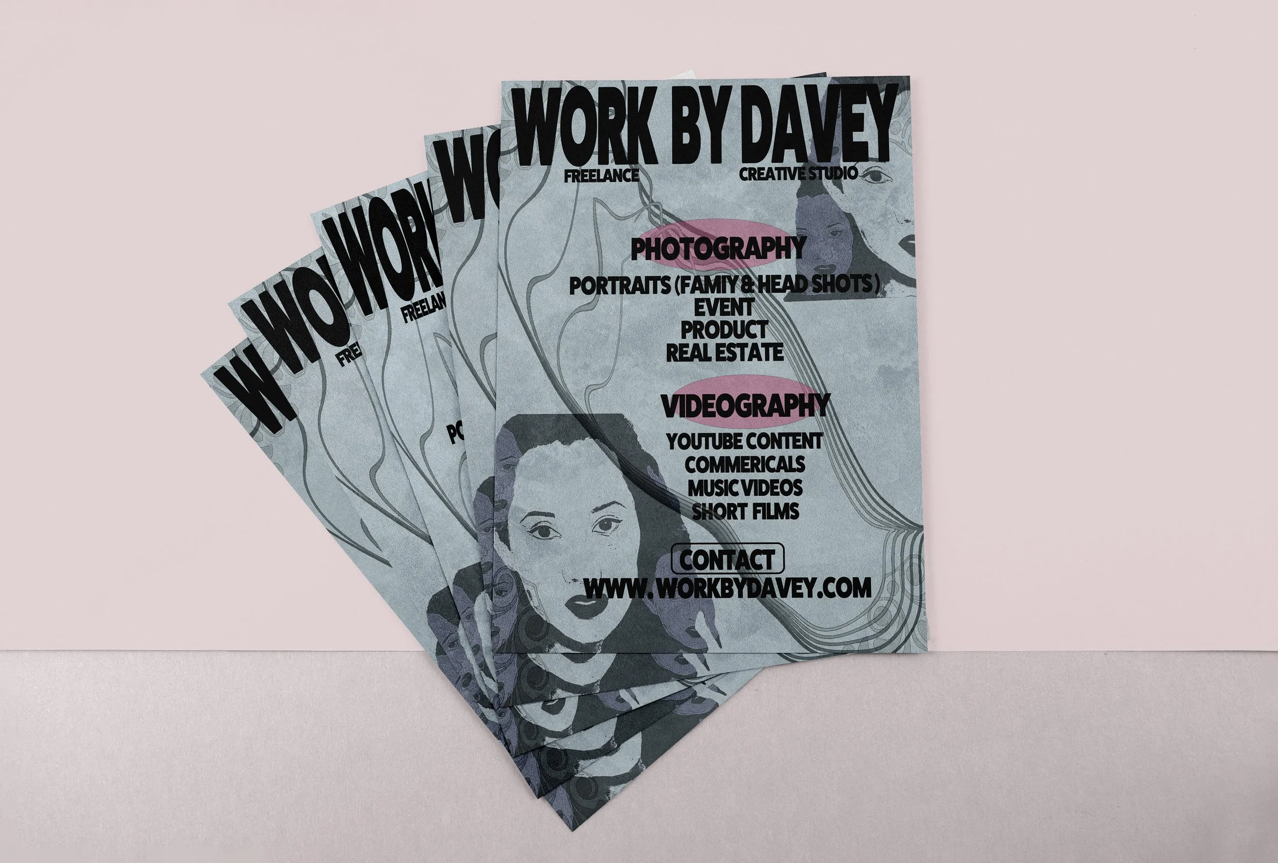
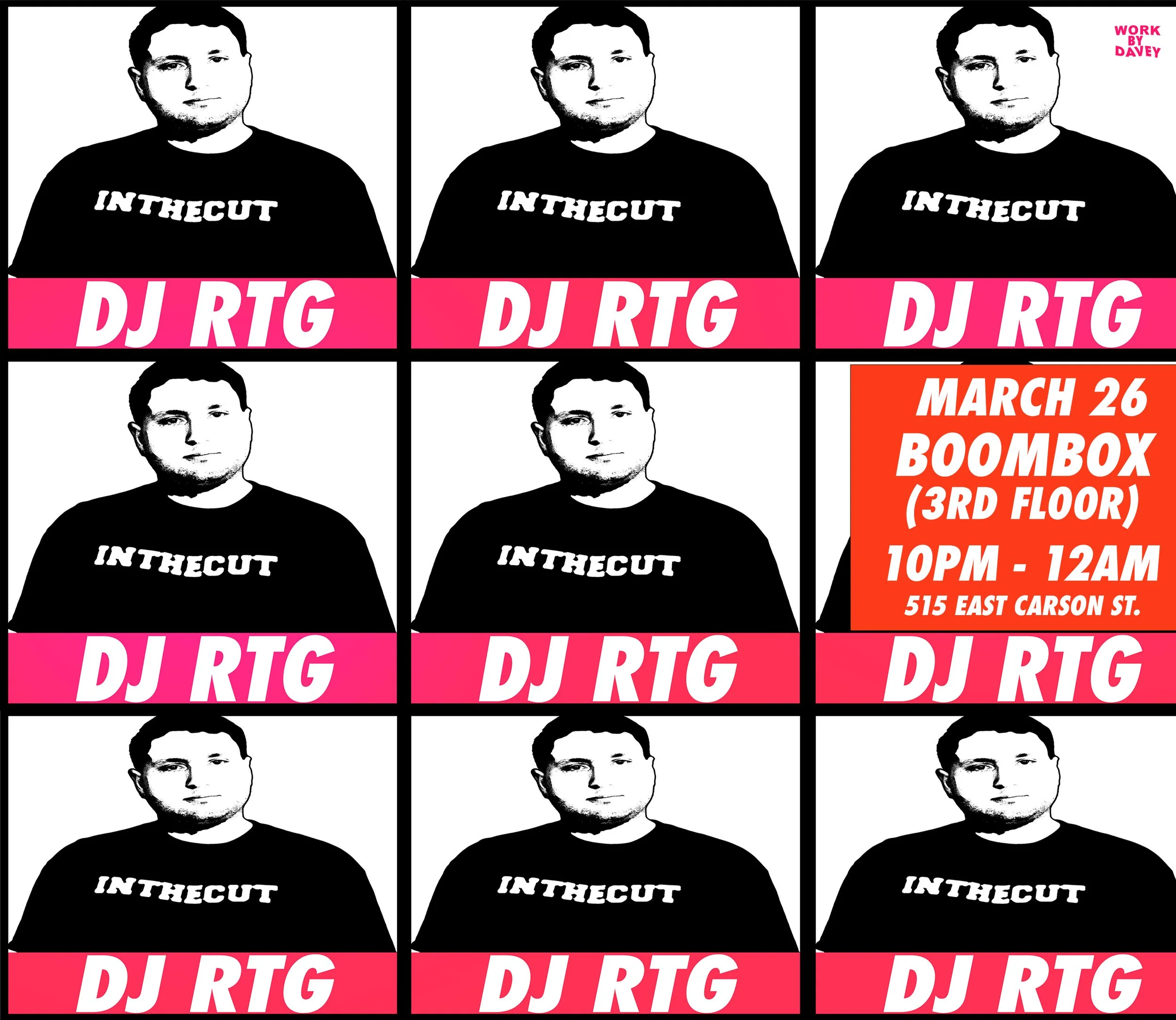


Creative Assets
Creative assets by Work by Davey connect brands to culture — social visuals, posters, album covers, and campaign graphics designed to move across platforms without losing their soul. Each piece is crafted to feel cinematic, built on Live at Sundown principles: honest light, real emotion, and strong visual rhythm. Whether it’s a social drop or a headline moment, the work always looks human — and feels alive.

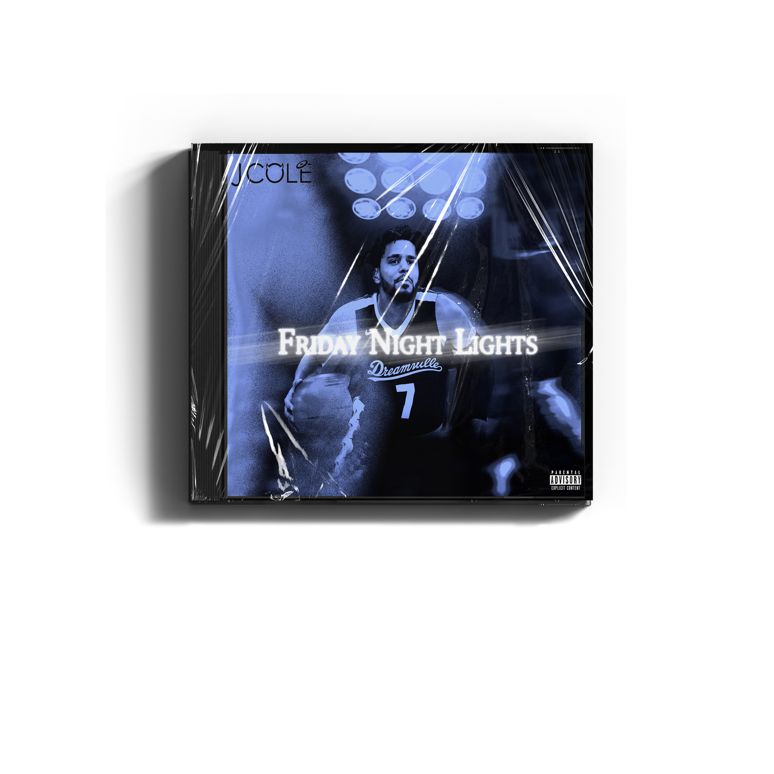
Album concepts have various graphic design applications, including creating artwork for albums or singles, packaging mockups, and CD or vinyl pressings to visualize the final product. Explore examples of my work.


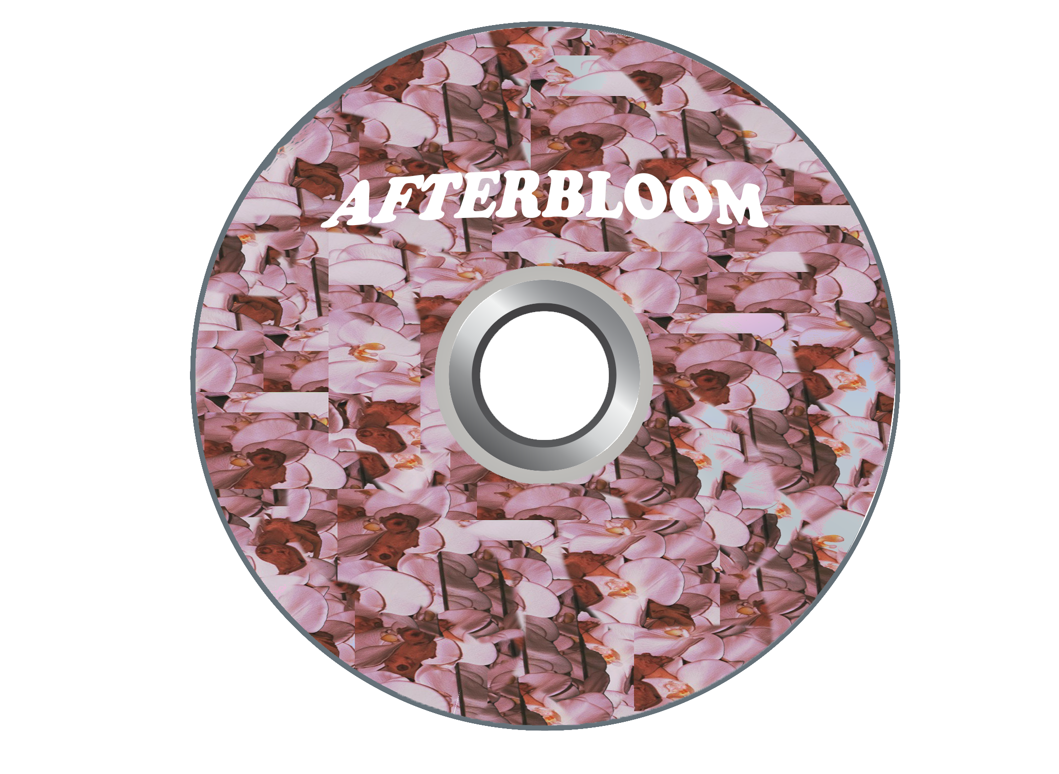

AfterBloom


FRIDAY NIGHT LIGHTS
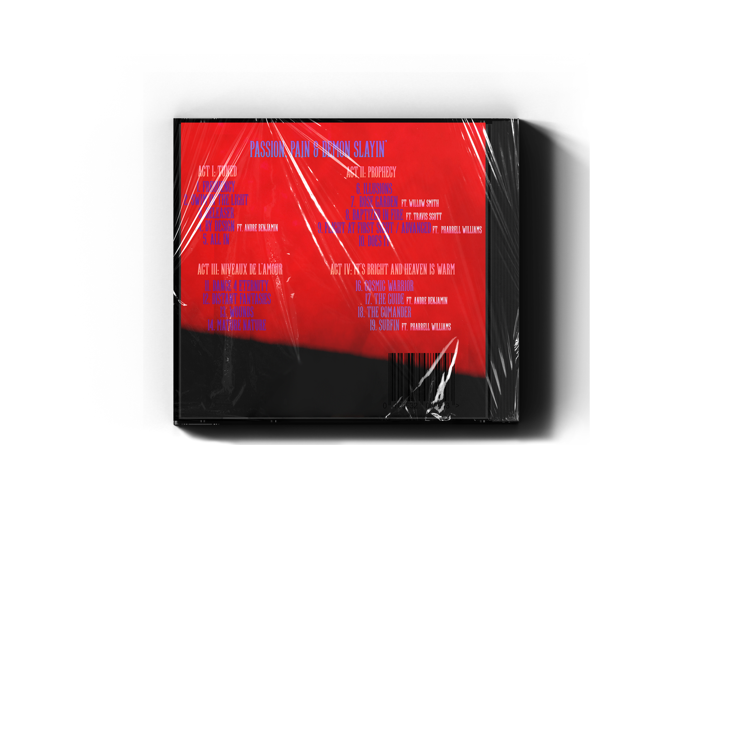

PASSION, PAIN, & DEMON SLAYIN’
Brand Identity
A brand identity from Work by Davey is more than colors and typefaces — it’s a visual rhythm. It’s how your story moves through tone, layout, and emotion. Each system is built to feel cinematic yet grounded, modern yet personal. With a foundation in Lens Language, every element — from typography to tone — works together to express who you are and how you see the world.
• Complete color palette, typography, and layout system
• Visual tone and imagery direction for cohesive storytelling
• Brand guidelines for consistency across every platform

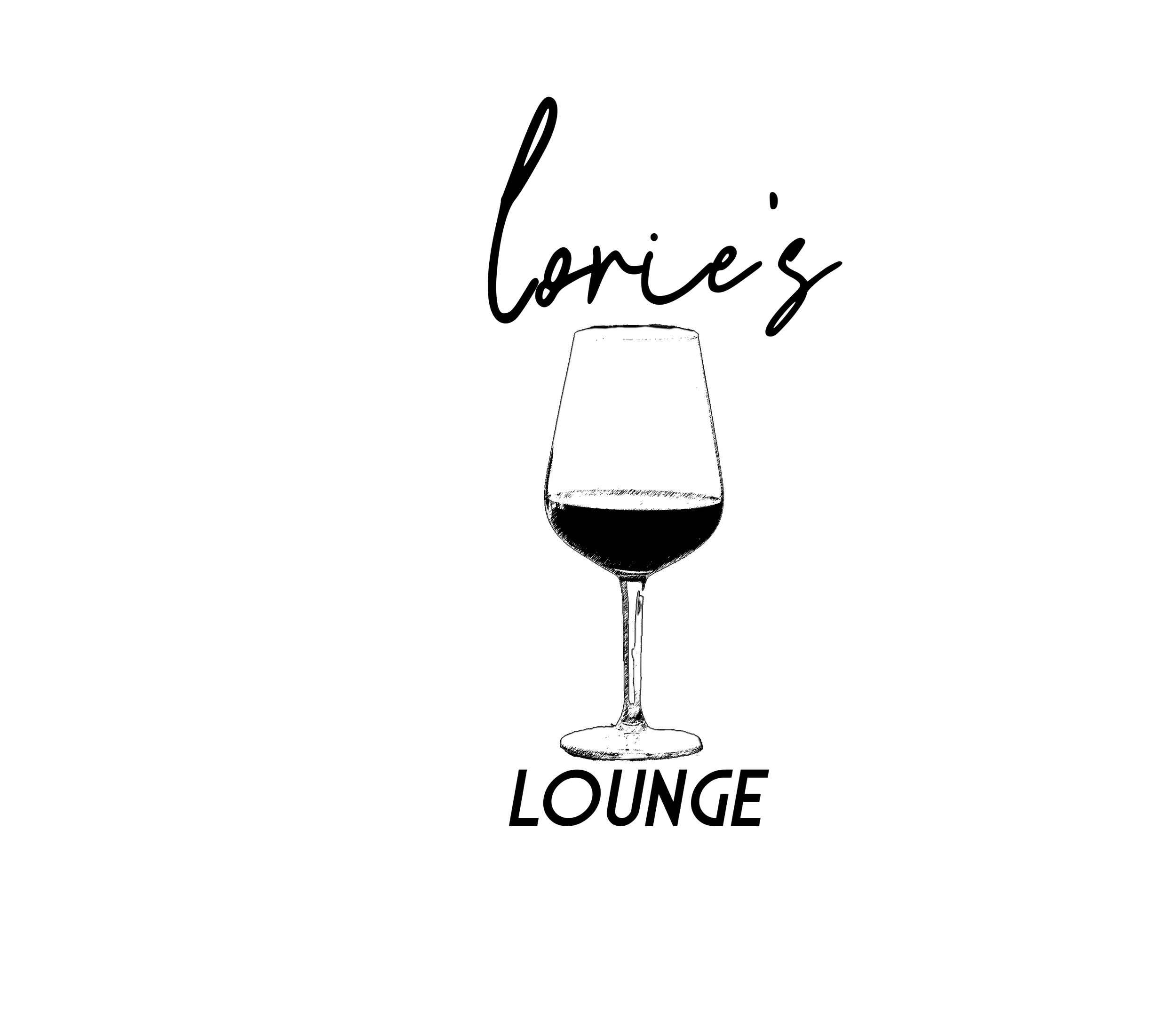
LORIE’S LOUNGE


Designed to feel like a night you don’t forget, Work By Davey built a vibrant brand system for Lorie’s Lounge—fusing pop-art energy with a cinematic glow. The visuals shimmer with personality: champagne yellows, retro fonts, and collage-style layouts that invite celebration. The result is an identity that feels modern, playful, and alive across every surface, from signage to social.
• Pop-art inspired logo suite and retro event graphics
• Custom social templates and lounge-style branding
• Collage-driven visuals blending culture and nightlife energy
LOGOS


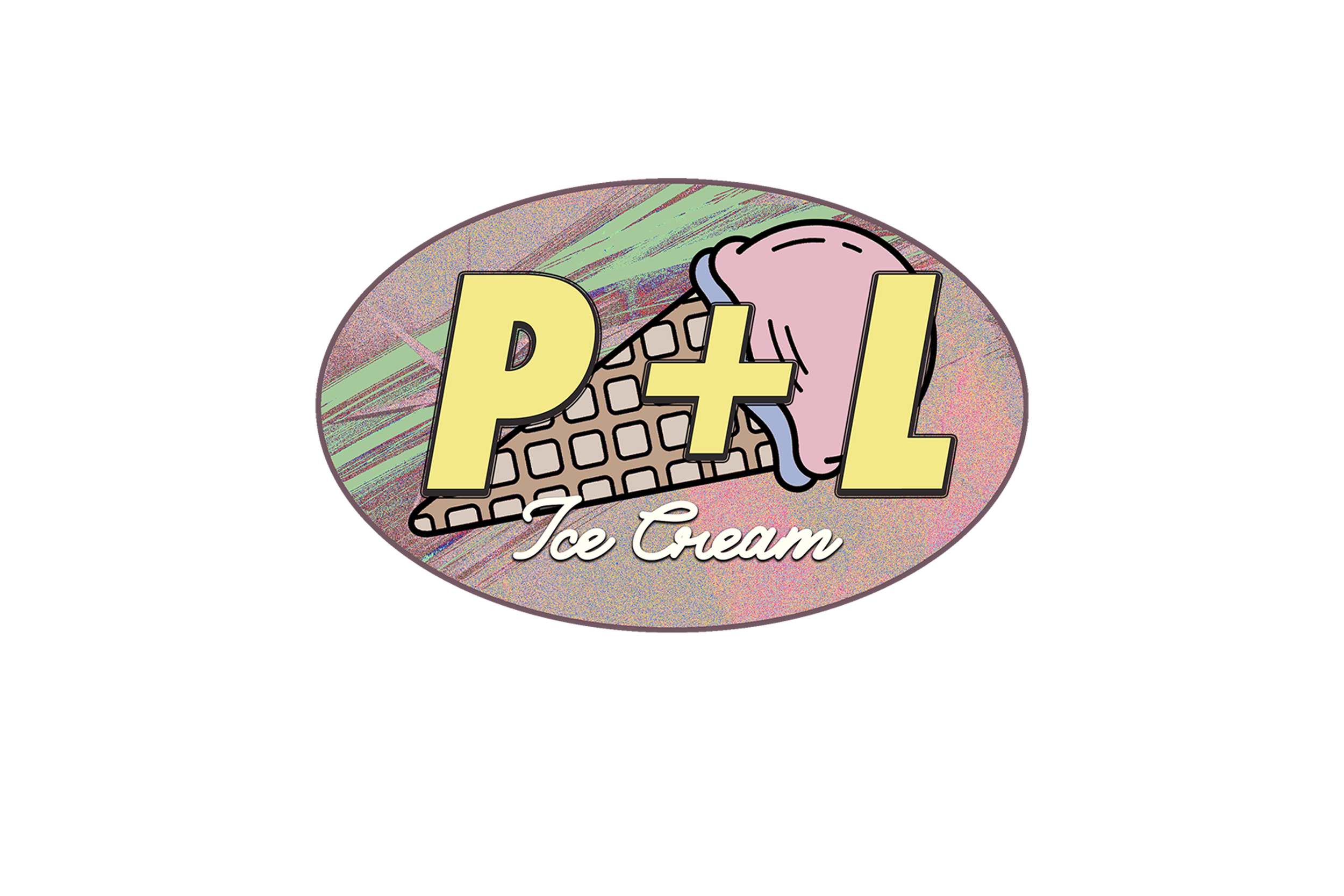
PAUL & LORIE’S ICE CREAM
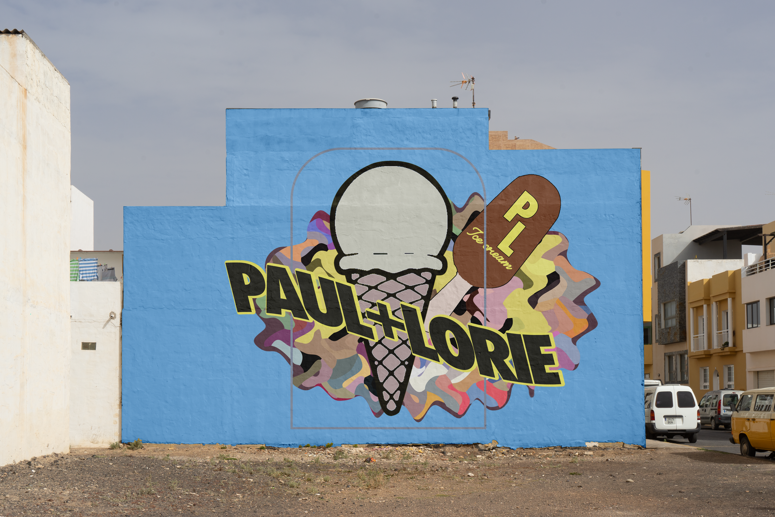
Work By Davey crafted a warm, cinematic identity that captures the spirit of family, flavor, and authenticity. Through a balance of bold typography, nostalgic color palettes, and tactile textures, the brand feels both premium and personal—like a story told through every scoop. The visuals connect heart and heritage, making Paul & Lorie’s instantly recognizable and emotionally resonant.
• Distinct modern-meets-classic logo system
• Flavor-based visual storytelling across print and digital
• Social media visuals that highlight community and craft

LOGOS


LAZY EYE BREWING
Work By Davey distilled rebellion, resilience, and craft into a brand built for outliers. Drawing from the founder’s story, the identity pairs rugged typography and weathered textures with cinematic color grading—creating a visual language that’s both raw and intentional. It feels like the kind of brewery born from experience, grit, and storytelling.
• Custom logo system reflecting independence
• Bold packaging mockups and taproom visuals
• Emotional brand story told through tone and texture
LOGOS


BRUSH FONT PACK.
Work By Davey is excited to unveil its very first digital product. The Brush Font Pack. With a raw, edgy aesthetic inspired by the rebellious spirit of 80s punk and classic slasher movie titles, available for FREE DOWNLOAD.
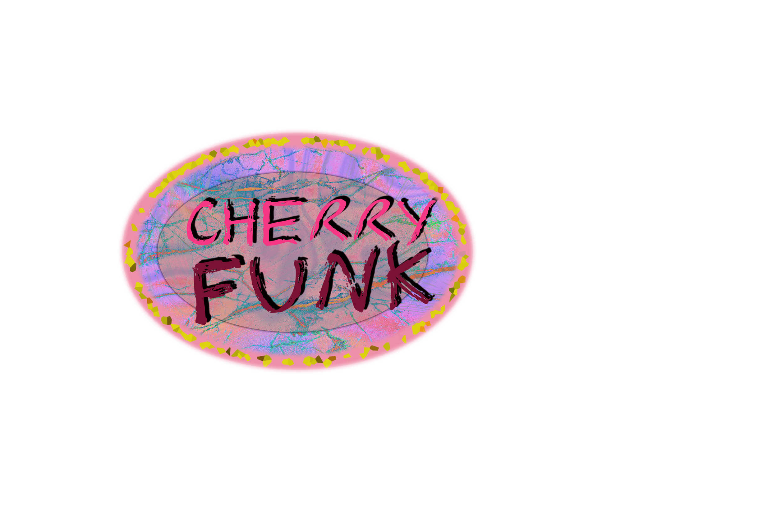
FONT #1

Uppercase

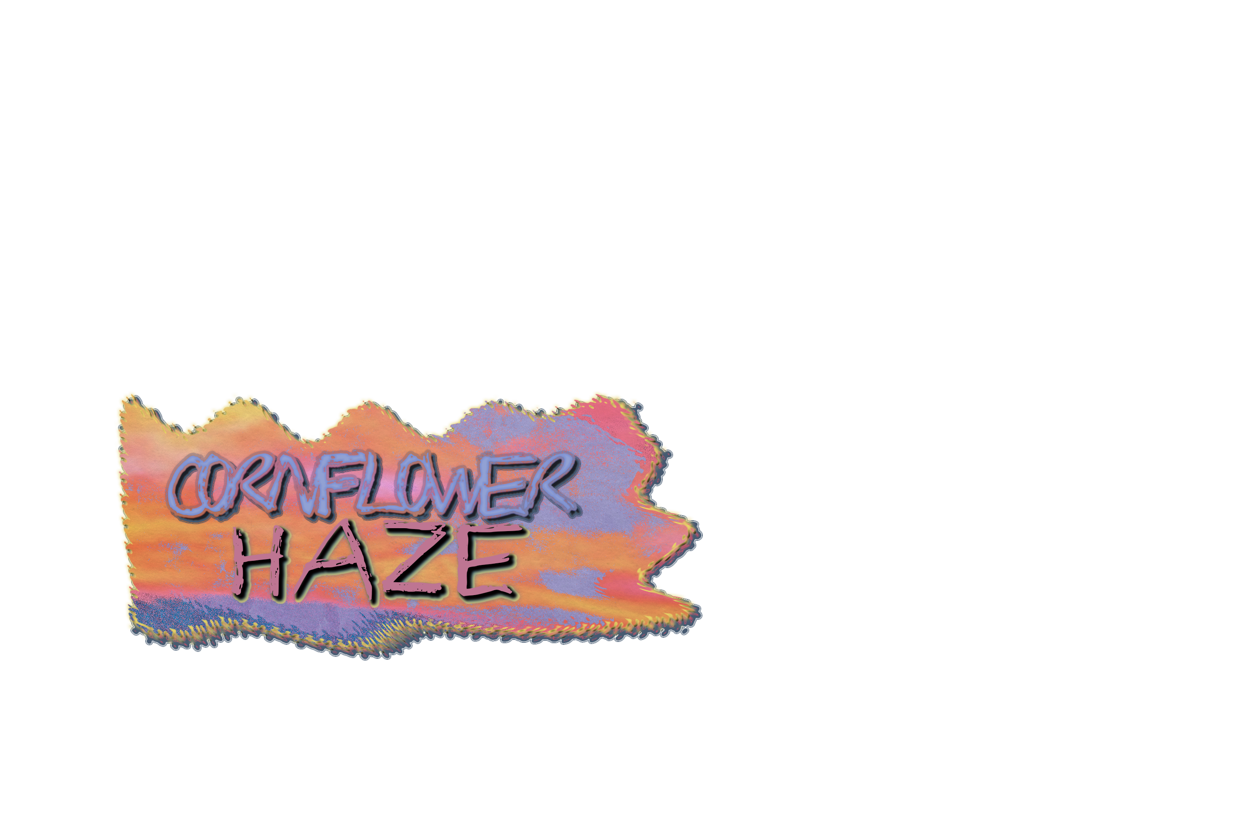
FONT #2
lowercase

Uppercase
lowercase
